

Shella theme :: How to add tabs in any place? HTML code snippet.
This article was created thanked Eduardo support request. I believe it may be helpful for other customers as well.
What is the HTML code snippet to add tabs in any place of the theme?
The theme has hundreds of options, you may check it in the user manual and video tutorials. Unfortunately, there is no theme option to add tabs in any place. Fortunately, you may add the following HTML code snippet to solve this task. Yep, you should deal with code, and it requires some basic HTML knowledge and Shopify online theme editor.
HTML code snippet for tabs
Here is an example of three tabs
<tabs-element class="tabs d-block" data-type="horizontal">
    <div class="tabs__head" data-js-tabs-head="">
        <div class="tabs__slider" data-js-tabs-slider="">
            <div class="tabs__btn active" data-active="true" data-js-tabs-btn="">Tab #1</div>
            <div class="tabs__btn" data-js-tabs-btn="">Tab #2</div>
            <div class="tabs__btn" data-js-tabs-btn="">Tab #3</div>
        </div>
        <div class="tabs__nav tabs__nav--prev" data-js-tabs-nav-prev=""><i></i></div>
        <div class="tabs__nav tabs__nav--next" data-js-tabs-nav-next=""><i></i></div>
    </div>
    <div class="tabs__body">
        <div class="active" data-js-tabs-tab="">
            <span data-js-tabs-btn-mobile="">TAB #1 <i>+</i></span>
            <div class="tabs__content rte overflow-hidden" data-js-tabs-content="" style="display: block;">Content for tab #1</div>
        </div>
    <div data-js-tabs-tab="">
        <span data-js-tabs-btn-mobile="">TAB #2 <i style="font-style: normal;text-transform: lowercase;">+</i></span>
        <div class="tabs__content rte overflow-hidden" data-js-tabs-content="">Content for tab #2</div>
    </div>
    <div data-js-tabs-tab="">
        <span data-js-tabs-btn-mobile="">TAB #3 <i> <svg aria-hidden="true" focusable="false" role="presentation" class="icon icon-theme-188" viewbox="0 0 24 24"><g><path d="M7.158,12.206c-0.124-0.123-0.186-0.27-0.186-0.439c0-0.169,0.062-0.315,0.186-0.439c0.123-0.123,0.27-0.186,0.439-0.186h3.75v-3.75c0-0.169,0.062-0.315,0.186-0.439c0.123-0.123,0.27-0.186,0.439-0.186c0.169,0,0.315,0.063,0.439,0.186c0.123,0.124,0.186,0.271,0.186,0.439v3.75h3.75c0.169,0,0.315,0.063,0.439,0.186c0.123,0.124,0.186,0.271,0.186,0.439c0,0.17-0.063,0.316-0.186,0.439c-0.124,0.124-0.271,0.186-0.439,0.186h-3.75v3.75c0,0.17-0.063,0.316-0.186,0.439c-0.124,0.124-0.271,0.186-0.439,0.186c-0.17,0-0.316-0.062-0.439-0.186c-0.124-0.123-0.186-0.27-0.186-0.439v-3.75h-3.75C7.428,12.392,7.281,12.33,7.158,12.206z"></path></g></svg> </i></span>
        <div class="tabs__content rte overflow-hidden" data-js-tabs-content="">Content for tab #3</div>
    </div>
    <script>// <![CDATA[
        theme.AssetsLoader.require('scripts', 'tabs');
    // ]]></script>
    </div>
</tabs-element>
You may paste it to the content field via admin panel or paste directly to *.liquid file via online code editor. I will stick with first option. Create a new page, switch to code edit mode, paste the above code snippet you should see the following. tabs
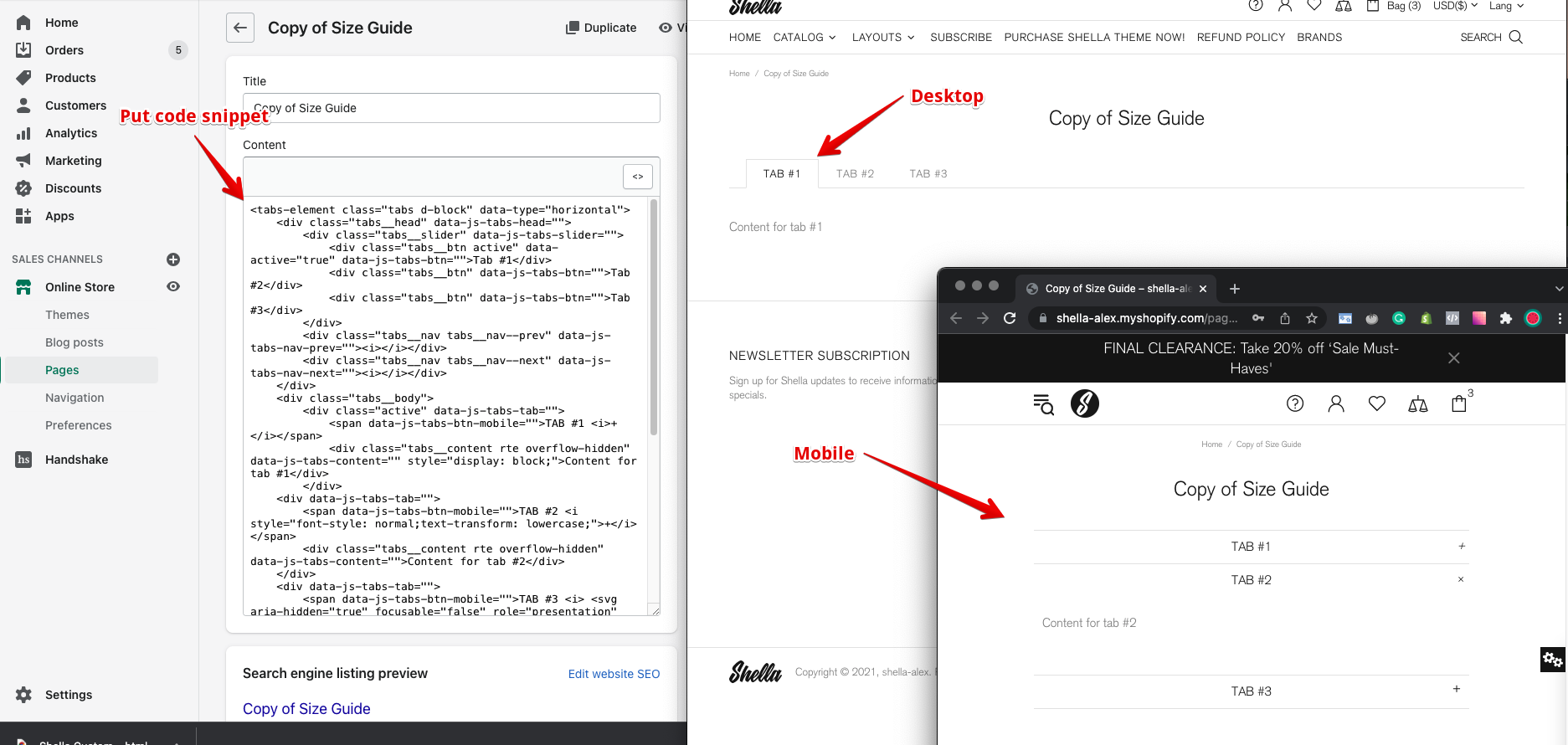
Add content to tabs.
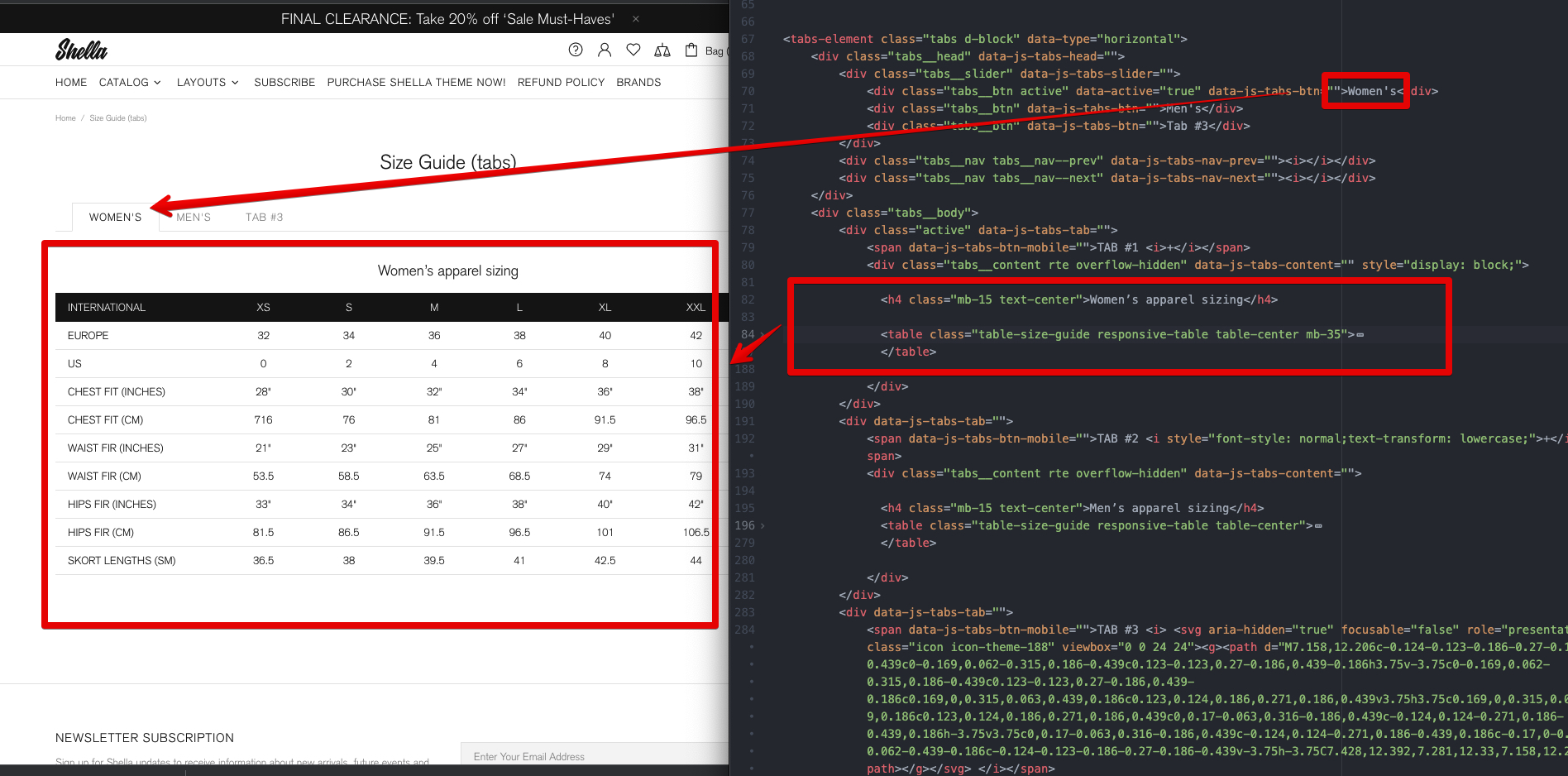
Replace texts "Tab #1", "Tab #2", "Tab #3" for captions
Replace texts "Content for tab #1", "Content for tab #2", "Content for tab #3" for tab content. The tab content may include the HTML code.
In my example I edited two tabs and put HTML code for table.
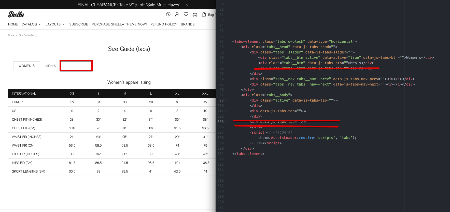
Remove tab
In case you want to remove tab, you should delete tow DIV tag with class tabs__btn at .tabs__head > .tabs__slider and data-js-tabs-tab attribute at .tabs__body elements.
I my example I will remove third tab and third DIV tags.
Add tab
To add tab you should add tow DIV tag with class tabs__btn at .tabs__head > .tabs__slider and data-js-tabs-tab attribute at .tabs__body elements.
You should keep the sequence of added tags. Second tabs__btn element will be linked to the second data-js-tabs-tab element.
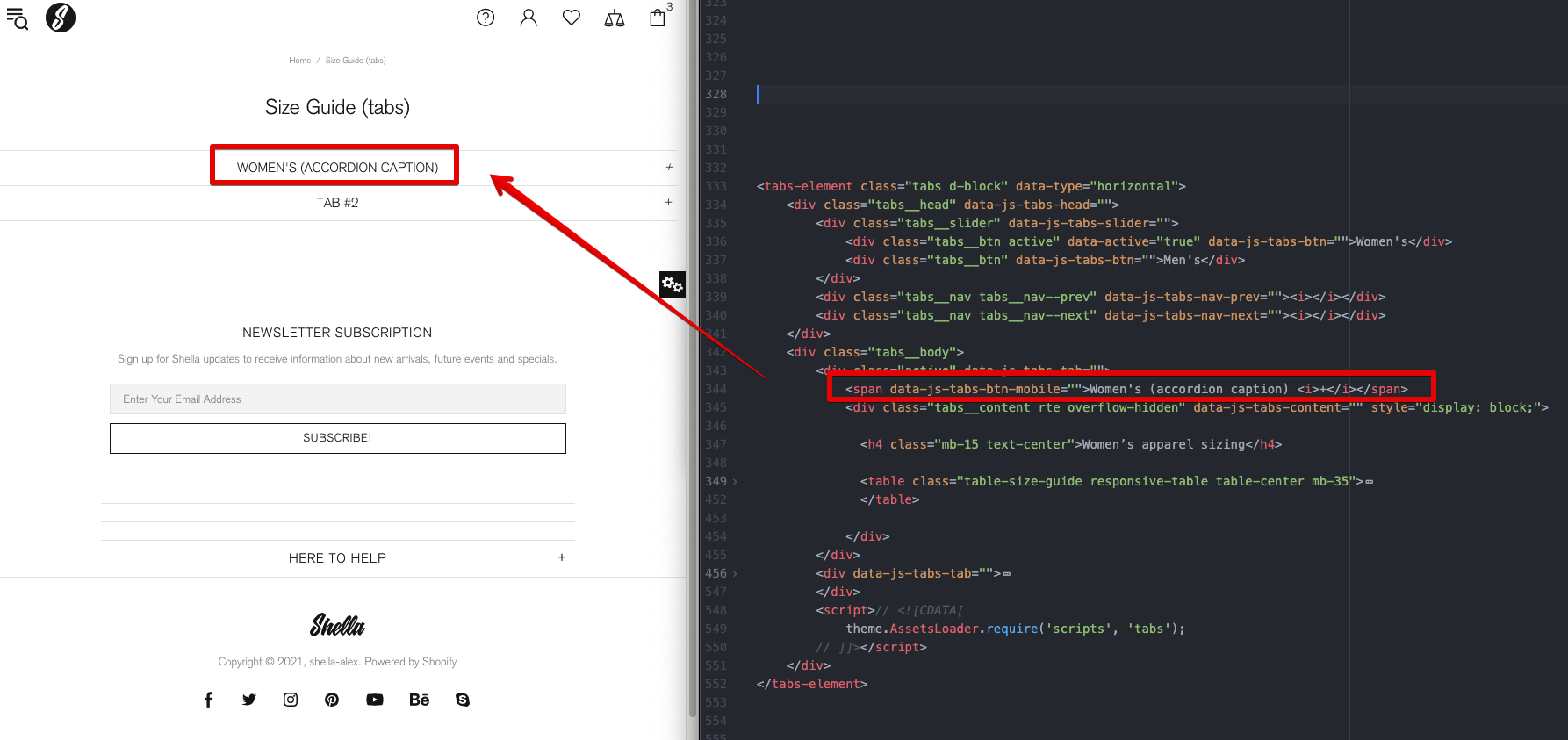
Mobile
Tabs at mobile transform to the accordion.
You should add mobile captions inside content element data-js-tabs-tab at span tag with data-js-tabs-btn-mobile attribute.
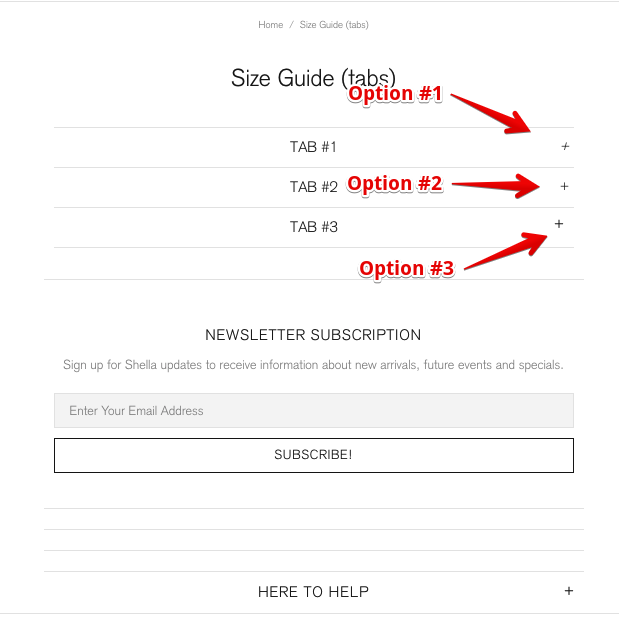
Inside the I tag you may set the open icon.
Option #1 - Plus sign, with italic font style
<i>+</i>
Option #2 - Plus sign
<i style="font-style: normal;">+</i>
Option #3 - Plus SVG icon
<i> <svg aria-hidden="true" focusable="false" role="presentation" class="icon icon-theme-188" viewbox="0 0 24 24"><g><path d="M7.158,12.206c-0.124-0.123-0.186-0.27-0.186-0.439c0-0.169,0.062-0.315,0.186-0.439c0.123-0.123,0.27-0.186,0.439-0.186h3.75v-3.75c0-0.169,0.062-0.315,0.186-0.439c0.123-0.123,0.27-0.186,0.439-0.186c0.169,0,0.315,0.063,0.439,0.186c0.123,0.124,0.186,0.271,0.186,0.439v3.75h3.75c0.169,0,0.315,0.063,0.439,0.186c0.123,0.124,0.186,0.271,0.186,0.439c0,0.17-0.063,0.316-0.186,0.439c-0.124,0.124-0.271,0.186-0.439,0.186h-3.75v3.75c0,0.17-0.063,0.316-0.186,0.439c-0.124,0.124-0.271,0.186-0.439,0.186c-0.17,0-0.316-0.062-0.439-0.186c-0.124-0.123-0.186-0.27-0.186-0.439v-3.75h-3.75C7.428,12.392,7.281,12.33,7.158,12.206z"></path></g></svg> </i>
Here is how it looks
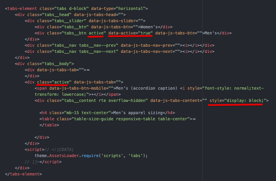
How to set active tab?
In the example snippet the first tab is active by default. You may configure another tab to set active.
You should apply four changes
#1 - Add active class to the tab caption and remove it from first tab
#2 - Add data-active="true" attribute to the tab caption and remove it from first tab
#3 - Add class="active" attribute to the tab content element and remove it from first tab
#4 - Add style="display: block;" attribute the tab content and remove it from first tab
You should get the following code
How to show the accordion on the desktop?
Set the data-type="mobile" attribute for the top tabs-element tag.
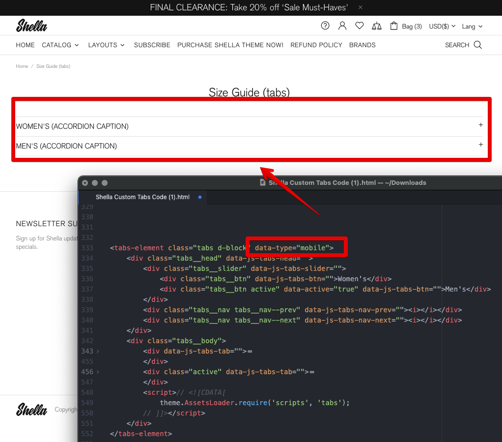
That's it.
Thank you for reading.
Enjoy the Shella Shopify theme.